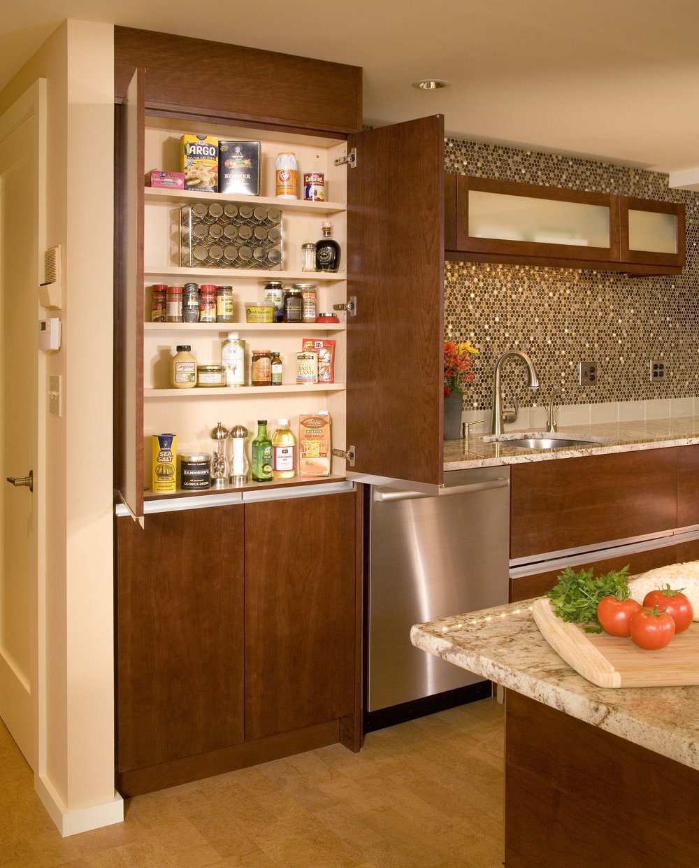
 Christine Suzuki, ASID, LEED AP (me!), was awarded First Place for Residential Small Kitchen, in ASID's 2015 Awards of Excellence competition. I love all of my design projects but it is nice when we receive confirmation that others love them as well!
This kitchen is in a small condo on Queen Anne hill. The original kitchen was a small rectangular room with two entrances, one from the hall, the second from the dining room. My role in this project was to create a space that looked and felt bigger, create an island with a breakfast bar and to add ‘a little bling.’ . We removed the wall separating the dining from the kitchen and added an island with a breakfast bar. We also bumped the back wall of the kitchen into the bedroom behind it giving us extra room to maneuver. I like to minimize any protrusions into the space, so I selected the recessed finger pulls for the cabinetry.
 The opaque glass insert create a feeling of space as well. The richness of the brandy stained cherry cabinets is balanced by the warm yellow color of the cork floor. We created a ‘feature’ wall behind the sink with glittering round metal tiles, centering the upper cabinets. The hanging metal hood doubles as a light fixture. All the upper cabinets are a double bi-fold tilt up style which makes it easy to access all items in the cupboards while retaining a clean horizontal line. The large pantry cabinet to the left of the dishwasher is actually a 6” deep cabinet that is fit within the studs of the wall behind it.
 We also created an upper U shaped drawer for the sink cabinet to gain precious storage space. The challenges for this project are typical of a condo, we needed to keep the drainage and venting in the same locations. The cement radiant heat ceiling meant that we had to create a lowered ceiling with shallow recessed lights. The old elevator was small and we were challenged in getting the granite counters up to the fifth floor. The ending result, however, was outstanding and the clients have enjoyed this Seattle get away ever since.
 We were able to remove the wall between the kitchen and the dining area and create a large island with seating for guests. We also relocated a fireplace that had been inhibiting space in the existing kitchen (see before picture) Acacia wood flooring coupled with horizontal grain bamboo cabinets are offset by a striking black mosaic tile backsplash.


