Storage solutions

Twas the Night before New Years

Twas the night before New Years, and Sally was sad,

Her kitchen had problems, the layout was bad.

She tossed and she turned to think what to do, 

'Can I have an island?', her options were few.

She needed advice to help her despair,

Christine the designer said, 'I will be there!'

The refer was move to open the aisle,

The back splash renewed to now be of tile.

An island was made for storage and sink, 

New venting was used to take out the stink.

The space plan was solved, decor was a treasure.

'My job here is done, now go cook with pleasure.'

Christine then did smile, as she drove out of sight,

'Nifty kitchens for all  and to all a good night!'

How small is too Small?

Lots of people live in small homes, apartments or condos.  The reasons are many and range from downsizing, to purchasing 2nd homes, to being in a transitional time of your life.  Many people are reducing stress by simplifying their life, getting rid of unnecessary ‘things,’ reducing the burden of a large mortgage payment etc.  Smaller homes mean smaller home payments which allows for independent/alternative employment and/or the freedom to travel. How small is too small and what do you have to sacrifice for this financial freedom?

‘Small’ depends on your perspective. If you are coming from a large home in the suburbs, a small home/apartment/condo can be 1100 sf.  A single wide manufactured home (trailer home) is around 1080 sf.  Homes in this size category give you a full kitchen, living room, bedroom, full bath, stacked washer/dryer and either a 2nd bedroom or a dining area.  If you are moving from a larger home, you need to purchase new furniture, smaller compact sizes and furniture with dual purposes.  Sofas that turn into beds, islands that have a flip up dining counter, etc.

Backyard cottages/DADU’s/ADU’s run a little smaller averaging 632 sf.  Generally, you will have to give up the 2nd bedroom/dining room and reduce your kitchen area.  If you are not following building codes, you can have a ladder to a loft bedroom.  The ADU that I designed for my small lot is 400 sf, very small, but I was still able to squish in a stacking washer/dryer.  General storage is a challenge.  You really have to cut down on your belongings.  How about 2 pairs of shoes one coat and one purse?  Can you do it?  Do you want to?

‘Tiny’ homes are a new craze of an old idea -mobile homes.  These tiny homes are built to be moved, possibly frequently, from location to location. They average 200 sf including a loft bedroom.  They often have composting toilets and solar panels so that you can ‘camp out’ on any piece of land as long as the property owners agree.  This is minimalism taken to a new level.  It looks fun and exciting – but for how long?  These homes are uniquely designed, have lots of charm and style and have interiors that are detailed out to use EVERY inch of space to its maximum, but how small is too small?


**Tumbleweed Tiny House Company

Award winning Kitchen!

Christine Suzuki, ASID, LEED AP  (me!), was awarded First Place for Residential Small Kitchen, in ASID's 2015 Awards of Excellence competition.  I love all of my design projects but it is nice when we receive confirmation that others love them as well!

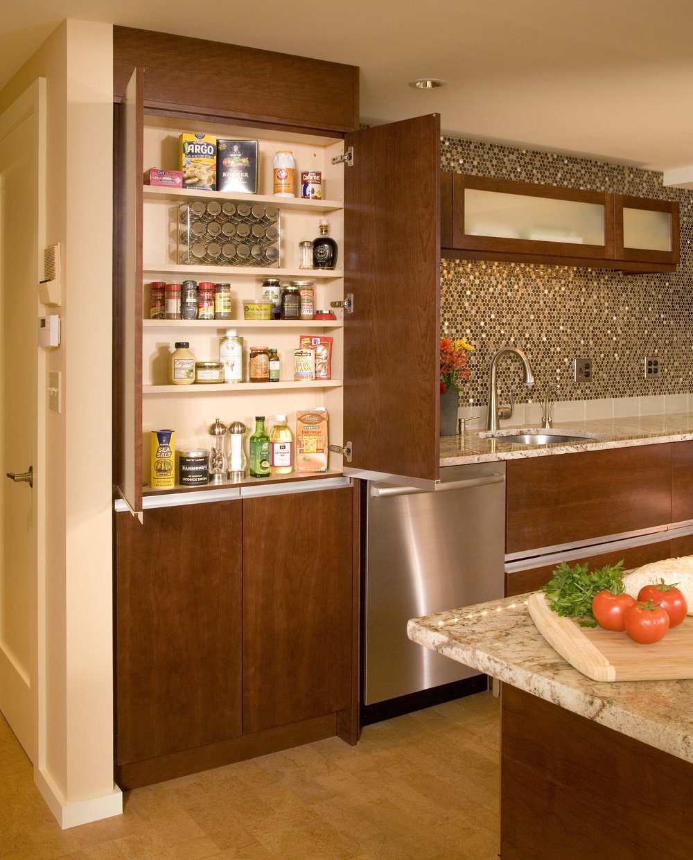
This kitchen is in a small condo on Queen Anne hill. The original kitchen was a small rectangular room with two entrances, one from the hall, the second from the dining room. My role in this project was to create a space that looked and felt bigger, create an island with a breakfast bar and to add ‘a little bling.’  .  We removed the wall separating the dining from the kitchen and added an island with a breakfast bar.  We also bumped the back wall of the kitchen into the bedroom behind it giving us extra room to maneuver.  I like to minimize any protrusions into the space, so I selected the recessed finger pulls for the cabinetry.  


The opaque glass insert create a feeling of space as well.  The richness of the brandy stained cherry cabinets is balanced by the warm yellow color of the cork floor. We created a ‘feature’ wall behind the sink with glittering round metal tiles, centering the upper cabinets.  The hanging metal hood doubles as a light fixture.  All the upper cabinets are a double bi-fold tilt up style which makes it easy to access all items in the cupboards while retaining a clean horizontal line.  The large pantry cabinet to the left of the dishwasher is actually a 6” deep cabinet that is fit within the studs of the wall behind it.  

We also created an upper U shaped drawer for the sink cabinet to gain precious storage space.  The challenges for this project are typical of a condo, we needed to keep the drainage and venting in the same locations.  The cement radiant heat ceiling meant that we had to create a lowered ceiling with shallow recessed lights.  The old elevator was small and we were challenged in getting the granite counters up to the fifth floor.  The ending result, however, was outstanding and the clients have enjoyed this Seattle get away ever since.

Soft Modern Kitchen

What is soft modern?  Modern design without the ‘coldness’ of what we associate with modern.  Soft Modern incorporates ‘tactical’ elements to balance against smoothness, ‘friendly’ colors that are muted and relaxing.  Round shapes are allowed to associate with rectangular shapes.  I was happy to be selected as the designer for this Soft Modern kitchen.

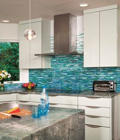
 I call this kitchen ‘Earth Water & Air’ because of the materials selected and their relationship to these natural elements.  Usually, a design using ‘natural materials’ has a dominant color of browns which represent wood.  In this case, soft reflective gloss green cabinets remind us of water,  little globe lights bubble in the atmosphere.  Blue and green mosaic tile creates a sense of air or smoke going up the hood and the satin textured granite counters say ‘stone’ in the very basic sense of the word.  The granite has a very subtle color without normal busyness of granite patterning.  The ‘hand’ of the stone, a subtle but distinct texture, along with the color, was the basis of the entire design, providing our first strong relationship to nature.  The enlarged windows allow this family to be ‘one’ with the outside elements.

Take a look at all the pictures of this kitchen on our website www.christinesuzuki.com under portfolio/kitchens.  

With gratitude, Christine

The Future of Kitchens

We are always trying to predict the future, with questionable success.  However, some trends are evident (as explained by Kitchen Distributors reference to the National Association of Homebuilders study  on kitchen design.)  The trend will be towards smaller homes.   With smaller homes comes smaller kitchens.  With smaller kitchens there is a bigger premium put on EFFECTIVE storage solutions;  replacing the walk in pantry with 24" deep pull out pantries, using every corner, every inch of floor space.    Even using the space INSIDE of the wall (yes we can build shallow cabinets that fit between the studs) so that you can gain storage without infringing into precious floor space. 

Many kitchens  double as a passage way to other parts of the home similar to this galley kitchen.  With space at a premium, kitchen designers use built in finger pulls on cabinets doors to eliminate protruding handles.  Space issues will also promote the open concept (no walls) between the kitchen, living and dining areas.  With some kitchens that means eliminating a wall and replacing it with an island.  With other kitchens it means eliminating the island. 

With openness comes exposure.  All the MESS needs to be hidden...somewhere.  Everything that is on the counter will be seen by everyone.  (Do you really want to see the rice cooker from the living room sofa?)  New openness will force us to rethink our storage/cabinet needs as well as our cooking accessory purchases.  Remember that brief trend that had garage style doors that pulled down to hide the kitchen?  Well, that may be a little extreme.....

Contact me with your thoughts! Ciao!

Storage Solutions for Short People (and others)

I'm a short person, have always been vertically challenged.  I remember using a step stool to climb up onto the kitchen counters, stand on the counter and open up that top cabinet to try to see what was in it.  The problem was that you needed to climb down and stand back around ten feet to see what was inside and then you only got to see the items in front.  We were so intent on using every bit of space for storage that we lost track of the fact that if it is so difficult to get to and virtually impossible to see, then it is really not useable, it was trick we played on ourselves thinking that we were smarter than 'others.' 

I used to look at those sleek Italian kitchens with the skinny upper cabinets and laugh "Oh, look how much storage is wasted, look at that empty wall space above that cabinet!"  But, HONESTLY, is it really wasted if you cannot access it?  What is REALLY wasted is the money we spend to build/purchase cabinets that we cannot access, therefore cannot use.

Luckily, there are now 'options'  that will avoid future generations of 'short woman' complexes. Introducing the 'double tilt up door' that allows you to lift up the doors for the entire upper cabinet with one soft push of the handle.  Look, you can see what is inside without climbing onto the counter!  Now reaching some of the contents on the top shelf is another matter.  For help with that, we can add a 'premiere pull-down shelving system' that will safely bring the shelves (and the items on them) forward and down to counter level.

 What about pantry storage?  We all wanted 'deep' pantry cabinets so that we could store more food.  Getting the food into the pantry was one thing, getting it out is another.  Have you ever had to crawl into the pantry to get to the stuff in the back?   Admit it, how many of you have sent a small child in there? 

The truth is, those pantries are inefficient for the same reason as our ceiling cabinets, you cannot see the items, and you cannot easily retrieve the items.  And this time being tall doesn't help.  In fact you probably have a harder time crawling into the cabinet.   Voila!  Our storage solution is the tall pull out pantry.  24" deep, this cabinet can store a lot of food.  But the food comes to you, via smooth gliding hardware that pull the shelves forward to you.  Furthermore, you can view the pantry contents from both sides.  You will never lose another can of chicken and rice soup again!  Everything is visible and accessible.  You can even adjust the wire basket shelving up and down to accommodate both tall and vertically challenged people.  The same 'pull out' concept applies to base cabinets.  Instead of having shelving that you have to crawl into to find cookware, select large drawers that easily roll out for your search    One final 'show me the money' item is the pot filler.   This glorified faucet brings the water to me and my pot (located at the back of the cooktop) as opposed to making me walk tragically across the room to the sink. 

As always, let me know your thoughts, good and bad!  Happy New Year!!

Appliance Niche

Last March I whined about appliance garages and the lack of really good options.  The ideal solution that I espoused is reflected in the picture on the left.  Shallow counter space to get close to your appliances, a 'hidden' storage area that is both convenient as well as discreet.  In this case, the storage area is located behind the 2' deep pull out pantry unit.

Amazing things can happen when you design your remodel to accommodate all of your needs!  Here is the same kitchen from behind the island.  Can you tell that there is a functioning work station back by the window?

Let us know your solutions to appliance use and storage!